Lego Space 1978-1992 (Tim Johnson, 2023)

The cover of the book with some Lego characters added for flavor.

Apparently I am the coffee table book review guy now. I hesitated to pick this one up because I’d long ago scrutinized old catalogs and bricklink pages to learn about these old sets (and built a few of them even) so just seeing pictures wasn’t going to be revelatory, but I wanted to see what it had to offer.

Is the title appropriate?

My main complaint about this book is that it’s not quite what it says on the cover. It’s really three things:

  • Light biography of Jens Nygaard Knudson including behind the scenes information about Lego’s process.
  • An illustrated tour through the Space sets designed during his era with discussions especially about the elements and how they’re used.
  • A fanfic illustrating the type of things one might imagine while playing with lego sets.

The last item isn’t very engaging and I skipped most of it. It’s the type of thing that’s extremely fun to write and not necessarily what I want to read. Maybe there’s some larger story that emerges but the ones I did read were just vignettes. I don’t want to throw too much shade on a project clearly made with love.

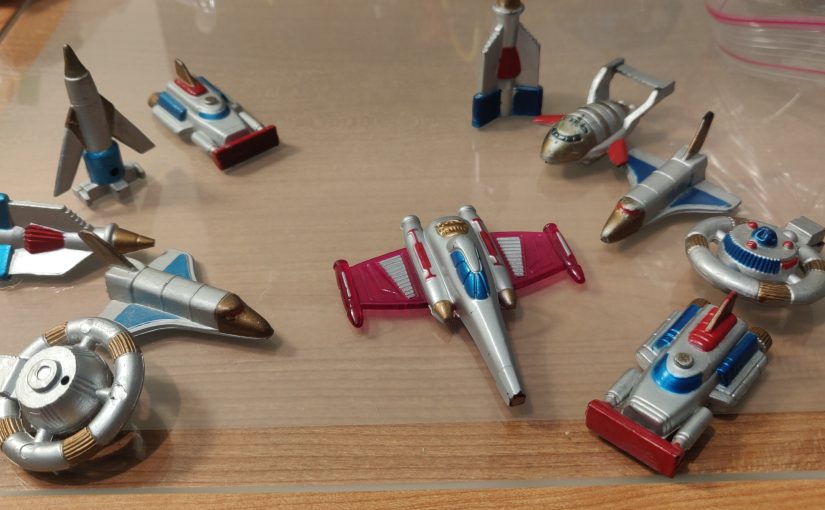
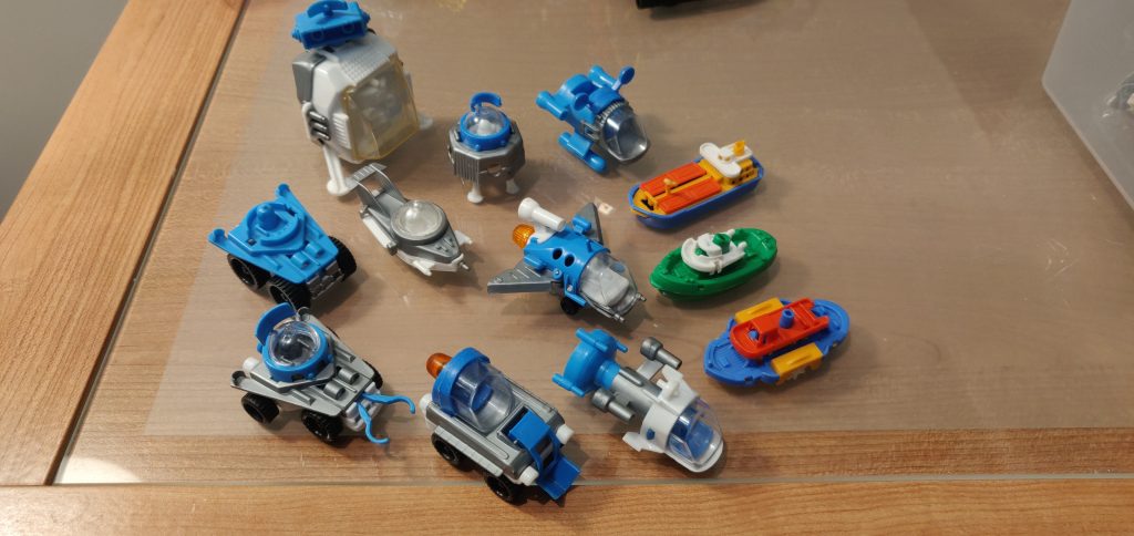
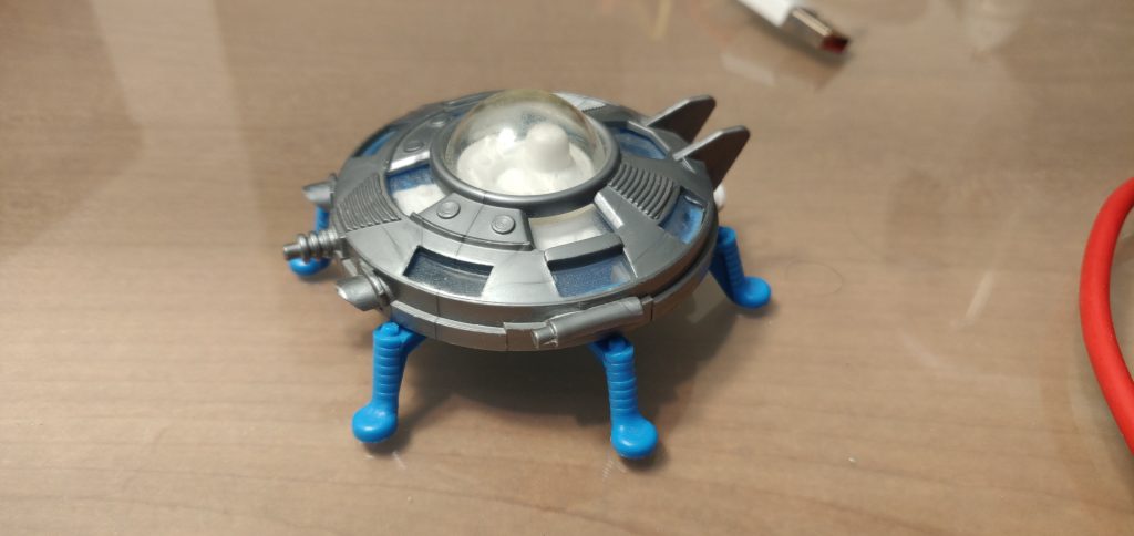
The second item has some gems about pieces and is an interesting lens to look through but gets repetitive as the sets themselves get, well, repetitive. At times it felt like an exercise in trying to use as much aircraft jargon as possible or squeeze some sort of interest out of the third little seat with wings scooter vehicle we’ve seen. Reading that the rover is blue next to a photograph of a blue rover isn’t a great use of time. But don’t get me wrong, ‘this element was originally made for pirate ships’ is the type of interesting Lego lore I love. I really would have appreciated if the stat blocks listed the set’s designer though.

The the first, then, is the meat for the readers. It includes interviews with Lego employees from the era and other background color. What era you might ask? Knudsen’s era. What are they asked about? About the process yes, but also about Knudsen. I think a more appropriate title would have been “Lego Space: the Knudsen years.”

The Text

I’m going to focus on that piece. The Juice of this book, so to speak, is information about the creative work behind Space. But it’s also where I have the biggest bone to pick.

There’s interesting information on offer! Niels Milan Pederson says that he originally pushed for a Jules Verne 20000 leagues inspired Steampunk theme and that some of it was recycled into Aquazone (p28). Apparently Aquazone was designed in ’91 and ready to go before launching in ’95 without changes (p194) It should be noted that he sort of got his wish with the Stingrays which, despite the use of neon, have a fair bit of steampunk DNA with their browns and brassy prints.

The information that the famous light grid was an in-camera practical effect using converging wires to achieve the perspective look is really interesting and there’s definitely a magic to seeing how it was done.

Some of the the concepts are already well known having been printed in a highly recommended Brick Journal article a decade ago. Lots of M tron concepts on p155 and some amazing never before seen concepts on p156 and 157. And the fact that half of the concept shots are already known is a symptom: the era this book focuses on has been covered extensively in the past.

Is this enough juice to carry a whole book? I’m skeptical.

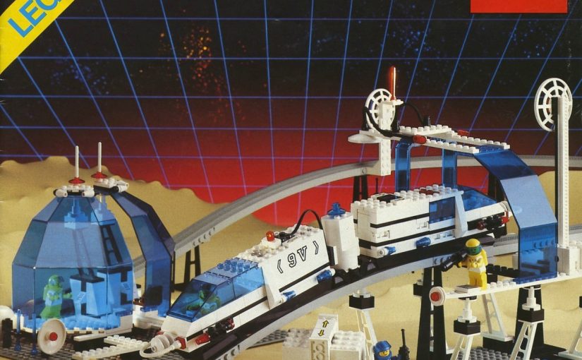
I still haven’t found my Lego Book

Several vintage Lego figures illustrating themes not covered in the book

For me personally, I’m once again left unsatisfied because they only covered the first half of Lego Space and neglected the more vibrant and colorful second half. None of the themes in that picture get treatment. Because it’s really about Knudson it for the most part misses the era of Space I find most interesting, 1990-2002. We get a (much appreciated) interview with Jørn Thomsen, but I want a full book devoted to his designs!

Retro Favicon

Let’s talk about something absolutely frivolous today. The tiny icon displayed in your broswer for sites, which is called a “favicon.” This is the original favicon I made in 2014 when I first set up a website. I believe I just popped open GIMP, threw in a serif typeface and spelled out my initials.

all caps E M R

This is fine, though bland. It served me well until I busted it on my webserver setup and started serving the whole site on favicon.ico (oops!) Fixing it has given me an opportunity to make something new. Still black text on a white field (until such a time as I find a new color scheme) and still my initials. But I wanted to pick a more unique typeface. Something that really spoke to me.

When I was first exposed to computer typography it seemed like a good idea to use zany fonts in the school papers I submitted. One I probably used the most was called Techno by David Berlow. I certainly remember the feel of a full paper written in Techno–not particularly legible (especially with my atrocious grade-school spelling) but extremely slick and modern looking. It loudly proclaimed itself as something you typed into one of these amazing ‘computer’ machines (or perhaps into the microscopic screen of an alphasmart.) All that optimism and retro cred was perfect. Techno was the font for me. So I went to see if anyone had uploaded it…

Nope! It still seemed to only exist as something you could use on Classic Mac OS, the long-gone operating system last seen on the iconic G3 iMac. I saw some fonts that appeared close (ie here) but the kerning was wrong and the name is unfortunately used to refer to a type of futuristic font instead of the specific one I was looking for so googling was getting me nowhere. And I’m not the only one who was looking for it either! Luckily, we can emulate an iMac and run OS9 to create an image.

Screenshot of Microsoft Word with 'e m r' written out in the font discussed. It's running in an emulated MacOS 9 environment so everything looks charmingly retro.

With a little bit of cropping and tweaking on the capital E, we have a new favicon:

all caps E M R but in a new font

I could stop there, but needing to emulate a twenty seven year old operating system just to get a font isn’t an adventure for everyone, so why not bring these fonts into the present? Simply copying the font files out will result in resource fork problems but luckily there was a period correct app called Font Clerk which could convert them into regular true type fonts. Here are the fonts on internet archive for your enjoyment. There may be a couple of extras in there because I installed Microsoft Word to get the above screenshot.

Screenshot of a modern system showing the retro font available for use

SnapShips and ZBuilders

A long time ago, I got my hands on Zoids Z Builders (aka Blox) and thought they were pretty cool, but didn’t really chase it further. As I sometimes do, I wondered if there was a modern equivalent, so I looked for ‘scifi robot cube building toys’ and found SnapShips. Over a decade after the debut of Z builders, it’s worth comparing these cube-and-greeble 1/72 scifi building toys of past and present.

Z Builders

Sprues!

The first thing you notice about the Zoids model is just how much of a capital ‘M’ Model Kit it is. Previous Zoids figures where less toy like-they where a little more like something you’d see from Tamaya or Airfix, though they contained motorized play elements. Z builders adds freely moving joints/possibility and a building system instead of a windup mechanism, but you are still looking at sprues when you first open the box, and decals when you finish the build. Like some Gunpla kits, the sprues are made of different colored plastic so no paint is required for a half decent paintjob.

Feel human, use tools

One interesting similarity between ZBuilders and SnapShips is that they both include a small tool for disassembly. SnapShips include a spudger, and Zoids ships with an ‘extractor tool.’

Zoids ‘blox’ elements are 14.7mm, and no rounder in inches.

The stickers are a pain. There is no guide so you have to sort of look at the box and figure out where they go, (again) more like a traditional scale model. They are in a grid and the squares are much larger than the places you need to put them, so you have to cut them to size. After all that, they don’t go on super clear. Wet transfer decals would have been better if they’re not going to die cut them anyway. They do add a nice sense of scale though.

The model is somewhat poseable. It won’t really hold a pose that involves much weight because the rubber joints are rather weak. It’s possible that the decades since it was manufactured have taken a toll on the rubber. Still, robotic dinosaur: very cool. Timeless even.

Wonder how it’s supposed to reload that arm gun without opposable thumbs? Perhaps its teeth…

SnapShips

SnapShips cube elements are 20mm

The SnapShips have much more detailed, Lego style instructions but they aren’t really as needed if you want to build it like a puzzle. The blocks lock together so that rather than flexing, they hold a specific shape. The parts are all in bags – no sprues which is honestly kinda chaotic.

The SnapShips contain three alt-builds each, similar to what Lego does with its Creator theme. I built the forward-swept wing design rather than the front-of-box design.

SnapShips give you tons of rectangular greeble panels, but a cube is relatively large compared to the scale so all of the vehicles you make will turn out very blocky. There are relatively few specialized pieces besides the aforementioned panels. Between sets there’s a strong compatibility at least – there’s only two color schemes. You get prints instead of stickers too. I think the appeal may be limited for SnapShips though. Trying to make something sleek out of something so boxy is going to be a challenge with the part set available, and the boxes are so big compared to the features people will want to capture is going to make that rectilinear form stand out.

Something else to consider about SnapShips is that it’s got a full blown tabletop war game of all things associated with it. Apparently it’s quite similar to X Wing. 1/72 is sort of a huge scale for dogfighting, but some reviewers seem to love it.

April/May Web Links

Might not stick with that title, but I do want to stick to the format. We’re in a period where “algorithmic” content feeds and search are becoming less than ideal, and there’s been a trend towards a smaller, more human web. I’ve long maintained a links page both as a more durable bookmark list and as a curated set of links to share. But not everything is evergreen; some things are timely, and I think a regular feature would be a more appropriate place for that. Plus it would motivate me to write a bit more, so here goes.

EV Nova Aftermath – (EV Nova Fandom Wiki)

EV Nova Aftermath was one of the most anticipated EV Nova TCs. Previously, all we had was the (defunct) Aftermath website, landing pictures, and other scattered remnants.

That all changed thanks to a friendly leak a year ago that didn’t really garner much attention. However thanks to the efforts of the indefatigable SharkyNebula, we now have pretty much everything on the wiki. I plan to write more about this and back up the resources on IA, but until then just marvel at these immaculate ship sprites. This was some of the best CGI that the EVN community had to offer, back in the day. They still look great now!

Data General Nova and Eclipse emulators (Wild Hare Computer Systems)

Tracy Kidder’s Soul of a New Machine is one of the great pieces of literature written about the computing field, and it centers on the team (lead by Tom West) upgrading the Nova into the Eclipse. Data General is a fairly obscure minicomputer company; the only one people still know by name is their more popular competitor, Digital Equipment Corporation, of PDP and VAX fame. So actually playing around with one of these wasn’t possible back in the day. But now there’s an emulator! You can even run it on a Raspberry Pi, which is exactly what I plan to do. If I get it running, I’ll write up a how-to.

https://fantastic-plastic.com/

For hobby modeling fans, this is a nice database of old model kits including images and enough information about them to find them via google with only a vague description. I stumbled across it while trying to figure out the provenance of a strange but very cool model kit, which turned out to be a Perry Rodan spacecraft. The model kit was purchased either at Neckers Toyland (still in operation!) or War And Pieces in Hartford (long defunct.) Seven years after War and Pieces closed, a Games Workshop store opened in the same location.

Dell HTPC thing from the aughts (youtube)

I found this video on Lemmy, interesting teardown.

World’s Fiasco of 2007 (yoyo fandom wiki)

In 2007 there was apparently some drama in the YoYo community. This would make an excellent Netflix special along the lines of The Pez Outlaw. I have no idea what the veracity of the story is and it contains some fantastical elements, but it’s also exactly the kind of foot-in-mouth emergent screwup that happens when you put enough people in a room and ask them to make decisions about how they should interact with their customers. I’d love to hear the other side of the story.

https://melonking.net/melon?z=/email/mailclient

If they still gave awards for “web site design” that included little site badges for the winner, this site would deserve them all. I feel like I haven’t even scratched the surface with it. Be warned – I have no idea what’s lurking under the surface here.

https://www.wheresyoured.at/the-men-who-killed-google

Ed Zitron has been on a tear lately with a lot to say about the tech industry. The basic observation that we’ve been frogboiled into a truly lackluster Google search experience is a correct one.

The Sky was full of ships (project Gutenberg)

A short story by Theodore Sturgeon, in Thrilling Wonder Stories, June 1947. I have a very vivid memory of this story as one of the first proper scifi short stories I ever really clicked with. Reading Del Ray’s history of early scifi made me think of it again, so I figured I should save the link for next time.

https://www.thelcars.com/

A CSS framework for making Star Trek style Okudagram websites.

Small Stuff

Looking back at this list, it’s interesting what stuck with me. They’re all vehicles! I guess I just find vehicles appealing. Some vehicles toys are well documented, so I won’t bore you with a repetition of the hotwheels wiki. What i want to consider today are what you might call modern “Penny Toys” are the kind of thing you’d find in a gumball machine, or on the table at the end of a party, discarded. They’re of a sort of hard to find now: not tied (legally anyway) to a franchise or character. But there’s something alluring about the mystery of trying to track down who made them, so let’s do it.

Bruder Mini: Space

Bruder is a toy company that still exists, making die cast vehicles. They no longer support their line of “mini” plastic vehicles, though they mention it in their history. There was a space line in silver, white, and blue, and more realistic vehicles in bright colors.

In Unit 01 colors no less. I’ve seen a small number of other palettes online.

I don’t know if the zany colored ones came out before or after the more common blue/white/silver ones.

Saucer in classic colors

Bruder Mini: Trains

Though long lost, I definitely had an an engine and a couple of passenger cars. Managed to find a lot of them on Ebay. They’re still adorable. They’re a neat combination of bright colors, crisp detail, and functionality. Not perfect fit and finish by any means, but at this price point, who’s complaining?

Accoutrements/Archie McPhee

These designs seem familiar

Not everyone was content to use public domain designs like flying saucers.

The easy part of figuring these out is figuring out where the design comes from-they’re mostly vehicles from thunderbirds (ignore the Star Wars one for now.)

You can see that the mold has been altered-it used to say Hong Kong but that’s been scratched out and China has been added.

The holes made them perfect to mount on Micromachine star trek stands

I initially had a tough time finding any attestation of these neat little plastic ships online. I know that at one point Accouterments sold them in a big tub (probably a gross each) but I can’t find that product photo any longer. I know I discovered this during the google era, because the models on the left are ones I purchased online.

I sent an email to Archie-McPhee, who got back to me with a link to this archived page:

Never seen the aliens before

They were called ‘alien and spaceship invasion.’ No luck on the star wars ship. I do wonder if it came from the same factory, but I have very little to go on for it. It uses a different type of plastic, but I swear the overall sensibility is similar enough. It came in a grocery store blister pack with a cooler looking spaceship with the same ‘moulded top screwed into acrylic bottom’ design, and a short knock off lightsaber type thing.

Z-Cardz

These plasticard punchouts came in randomized packs. The ink has held up surprisingly well. Influences are sometimes clear-a couple look like they’re from Cowboy Bebop, and I think I see a Droid Fighter. Classic shmups seem to have influenced these heavily as well.

We had a lot of fun building these back in the day. I managed to get my hands on some un-punched ones, remind me to scan them so you can make your own copies out of plasticard. If that’s important to you for some reason.

This product line eventually evolved into much larger more detailed models, and apparently a tabletop game.

Shackman & Co Five Piece Train Set

Five to a pack

It was surprisingly easy to find these considering I had only a single one and no accompanying documentation. I think I just searched for “small plastic train 90s” and the like.

These seemed to have a random assortment of colors. They’re four parts: two sides, top, and chassis. Very neat little pieces. All identical. They shipped in a Christmas ornament which itself looked like a train. Something about the soft shape and tiny size made them super appealing to my kid self. Always wondered if there was a whole line of these, but it’s just the one mold.

Pretty close to N scale though.

I heard you like trains so I put a train in your train

Name Collisions in EV Nova

EV Nova was a formative game for me. One thing I noticed about it, and wanted to document, was that there are a lot of what I’ll call name collisions: names that are almost the same but refer to different things. Did I miss any? Leave a comment, I’ll add it.

Temmin Shard / Shard (faction)

LPAD station, where Temmin Shard takes you

Temmin Shard is a character in a side quest. However, “Shard” is also used to describe a faction formed when you win the Fed campaign and everyone else comes after you.

Krane / Kane (incl. Port Kane, Kania, and the Kane band)

Port Kane
Earth, with Kane band, but also a place where you might encounter Krane

Omata Kane invented galaxy-spanning hypergates and a bunch of things are named Kane in her honor, including earth’s artificial ring, the Kane Band. There’s also a Port Kane in the Kania system. Krane is the sociopath leader of the secret fed faction that you work for in some campaigns. Very different people.

Glimmer / Gli-Tech / Gli-Tech-Nia

Home of the GLi-Tech corporation (formerly known as GLiMMER until the discovery of the Glimmer system)

Both are companies that make missiles. Huh? Gli Tech also owns an entire planet, called Gli-Tech-Nia. But wait, Glimmer is also the name of a star system. Surely this piece of fluff for Gli-Tech-Nia clears it up:

Associated Guild Of Free Traders / Free Traders

Pirate carrier used by both

Two opposing pirate factions that fly the same ships. One is hostile by default, the other isn’t. No idea which one though; and feds don’t care which one you blow up either. According to Word Of Atmos this is intentional.

Polaris / Polaron Cannon / Polaron Torpedo

Polaris are one of the game’s major factions. Polaron refers to a Federation weapon. But the weapon is pink… the color of Polaris technology. And the Polaris have a Polaron Torpedo which is pink but apparently unrelated. Maybe Polaron refers to some specific scifi gubbin, but then that’s still colliding with the Polaris.

Vella / Vell-os

Vell-os are a race of psychic transhumans and mostly extinct, Vella are a neighboring Arouran subfaction.

Wraiths / Wraith Cannon / Wrathii

A wraith
Wrathii fired from a Wraith cannon (no relation)

Wraiths are a race of sentient space-monsters, Wrathii are pink projectiles that the Polaris fire out of a Wraith Cannon. Also the Wraiths are right next to the Polaris.

TOWCB / TCTLIDS

The Ones Who Came Before are your standard ancient race of aliens trope, TCTLIDS are The Creature That Lives In Deep Space harvested for drugs, an abandoned plot hook that somehow remained in the timeline preamble.