Lazerpig is wrong about the Defiant

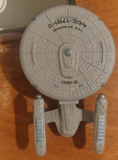
I really didn’t think I’d do another blog post about Star Trek Spaceships possibly ever, but Miltuber (and NCD darling) Lazerpig did the angry review thing on the Defiant.

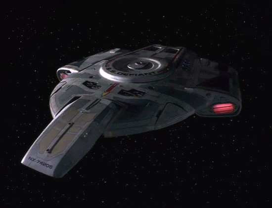
While Defiant isn’t my favorite Trek ship, DS9 is probably my favorite Trek show so I felt the need to rise to the occasion. Or at least gather my thoughts so I don’t need to send the same rant to multiple different chats.
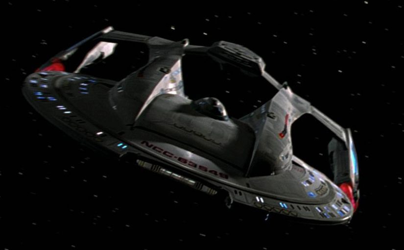
Why build a defiant

Lazerpig has chosen to critique the Defiant as it was designed, not the production variant that includes a cloaking device. So I don’t think we should be evaluating its actual uses in the same way we might evaluate a ship that went into full production and deployment.

He spends a lot of time talking about why Fed ships tend to be cruisers but doesn’t really engage with why you’d maybe want to build something like the Defiant. I thought it was obvious from the dialogue; it’s meant to be a glass cannon that they could field in greater numbers than cruisers. Which makes a ton of sense if the goal was something they could launch at short notice in great numbers to rain absolute hell on some Borg cubes.

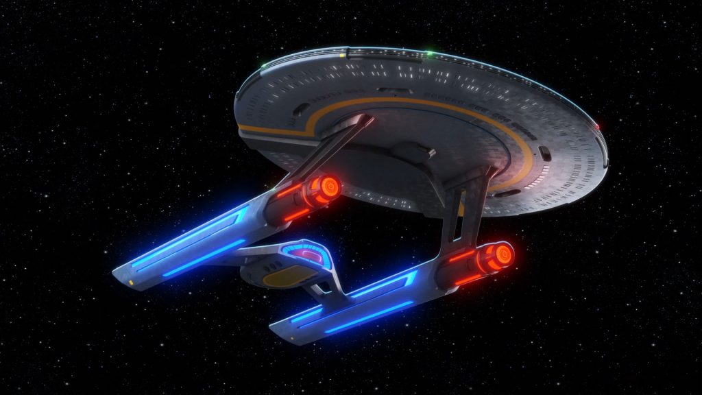
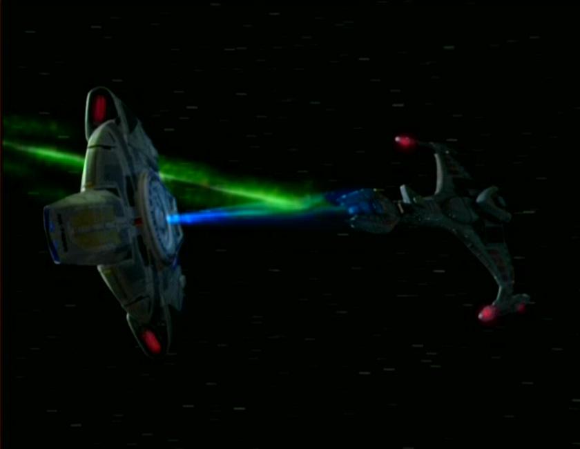
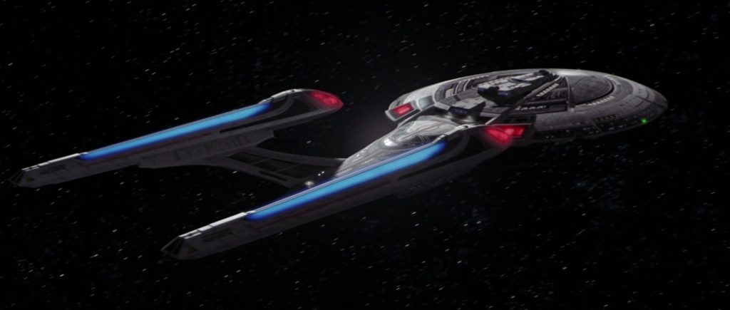
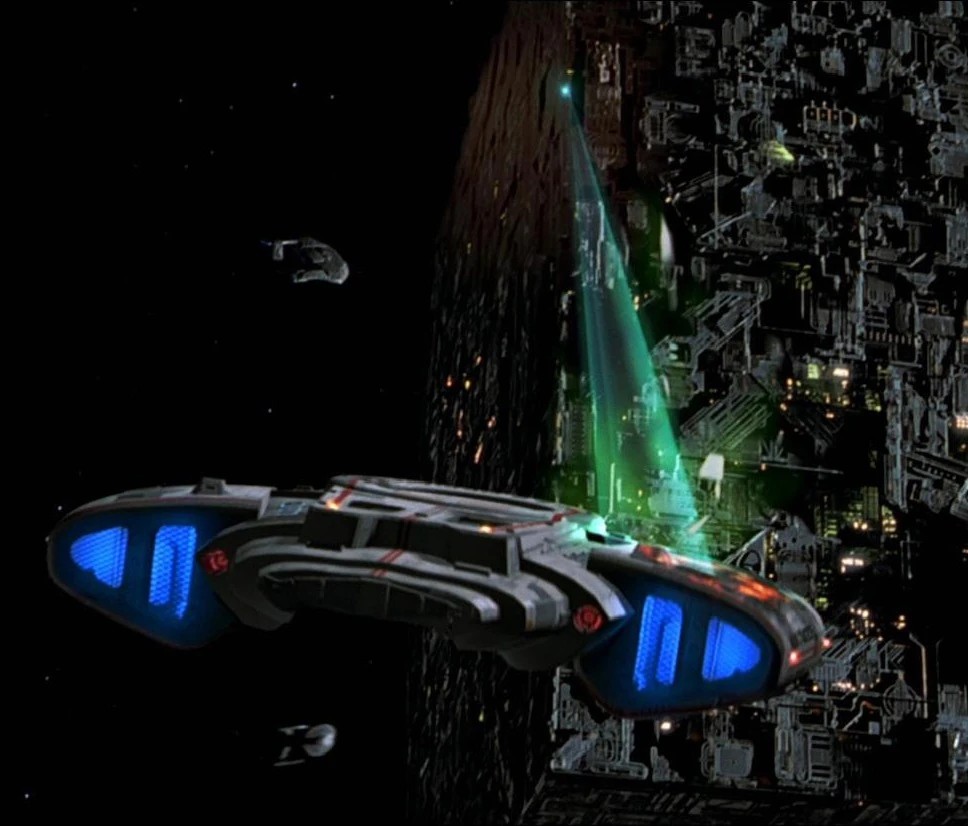
The amount of firepower per ton on the Defiant is outstanding. It can solo an Excelsior. Came damned close to destroying a Jem’Hadar Dreadnought. They probably didn’t intend to deploy only one at a time!

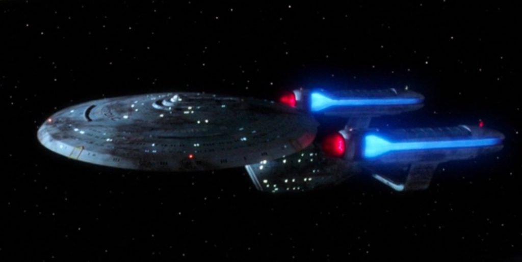
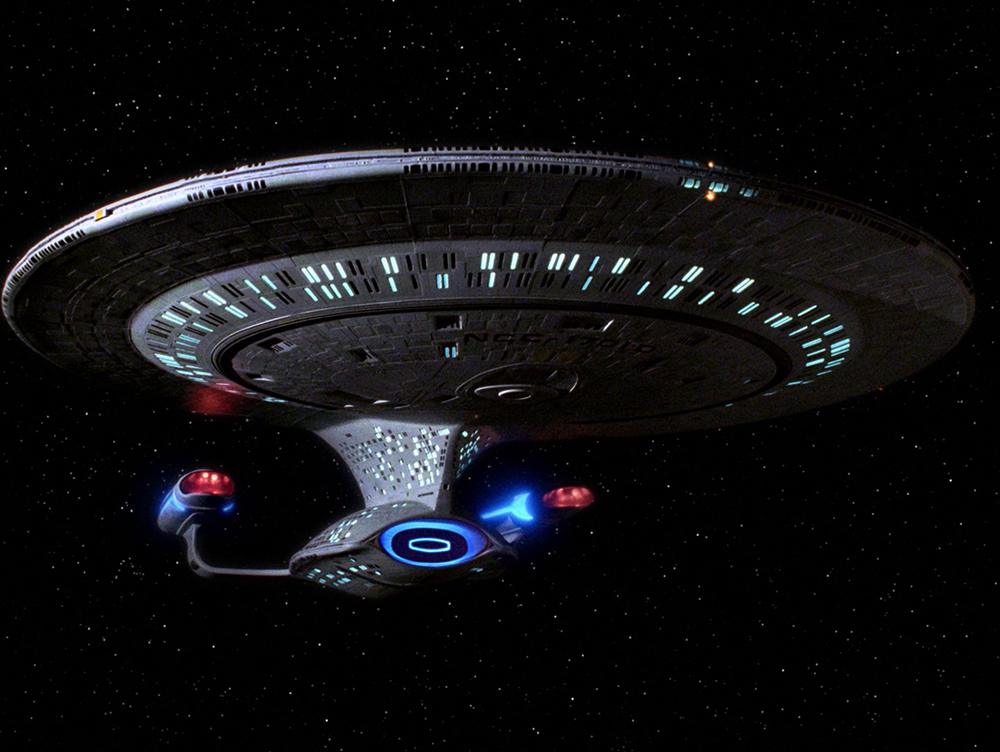
Also consider the risk of deploying a Defiant. I say “a” Defiant because Sisko chewed through two. When a Galaxy goes down the Federation is taking a massive loss in personnel and material. When a Defiant goes down, you build a new one. Everyone probably got to the escape pods because the ship is tiny anyway, but if they didn’t, whatever, what’s one squad of mutinous cadets?

Railguns don’t work in Trek, and his other intuitions seem wrong

He makes much of the battle of Sector 001 (the opening of First Contact), but really I think that whole scene shows that the Federation was prepared for the Borg successfully. They blew heck out of that cube. He for some reason thinks that Trek shields can only stop phasers and that they should simply use regular guns on the borg because Picard tommy-gunned one drone.

Maybe it wasn’t clear enough in the movie, but that wasn’t an actual gun with actual bullets, it was a hologram. So it really shouldn’t tell you “bullets always penetrate shields”, it indicates that the Borg hadn’t expected to be shot with a hologram, but they don’t do it again because the Borg adapt to new threats. There’s no indication that a railgun would be any different. You get one railgun shot and that’s it. But it’s sillier than that.

We definitely don’t in star trek, as far as I can recall, ever see a situation where ‘oops, got hit by a solid object because our shields don’t work against those’ but we get a lot of a lot of ‘bonk’ “Shields at 50%!”If anything, shields are more effective against kinetic threats. Star Trek shields presumably already work against solid objects traveling at high speeds because they are able to travel through space without getting shredded by micrometeorites, debris from exploded enemies, and other space junk. The big deflector dish is called the “Navigational deflector” for a reason. You can see this in the opening titles of Strange New Worlds; an asteroid smashes harmlessly against the gorgeously redesigned Connie. Also, projectiles in Trek like torpedoes are already solid objects–you can’t load cadaver-Spock into an energy burst. Besides, we regularly hear of probes being launched, which presumably also can’t simply sidle up to enemy ships and detonate.

Feds don’t use railguns because a phaser is a swiss army knife that can be used (by both the characters and the writers) to deal with many different situations and if you have the right intel can bypass enemies shields. The writers can only do so much with flung metal; a scifi beam can do cool scifi things as needed, and that’s exactly the type of flexibility he himself highlighted in the beginning of his video.

But suppose your targets shields are down, one might object. In Trek, an unshielded target is already dead. A single torpedo can usually destroy an unshielded ship, or you can board it, or use your transporter to space the entire crew, or use your phasers to disable its weapons to have a nice chat. All that is to say, Trek weapons are judged mostly on their ability to strip shields. Considering how effective shields are at keeping a superluminal spaceship from splattering on interstellar dust, I think it’s safe to assume that they’re more effective against solid objects than they are against energy weapons.

But it gets worse for mass drivers. Conventional projectiles are simply too slow to be effective in an environment where targets can maneuver faster than light. You’re not going to be able to hit stuff with a railgun in Trek. The speed of light is the bare minimum and only effective at “both ships are on screen at the same time” range.

Sourcing issues

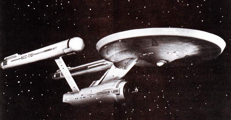
This is personal preference, but I don’t like his sourcing. He says Star Destroyers must not be do-anything ships because there are a million variants, but there are only a million variants because people writing what’s basically blessed fanfic all want to add new space ships. On screen they use one or two variants per trilogy. Similarly, his harshest criticism is centered on basically the deck plan of the ship from the technical manual that only exists to look cool and be nerdy. It’s a fictional spaceship and he barely touches on the way it works in the fiction, instead focusing squarely on ancillary minutia. Maybe this is part of his format because he usually talks about real life vehicles and the information is factual. But in a show like Trek, the only truth is the show that ends up broadcast. Treating outside information as gospel is, in my opinion, silly. A Star Trek spaceship isn’t a collection of statistics, it’s a prop used to tell stories and it’s more or less whatever the story needs it to be.

It’s just a game, who cares

I just want to add the caveat that this is a frivolous response to a frivolous piece. In defending the honor of a fictional spaceship I’m not trying to drag down your favorite YouTuber or anything. If something genuinely animates me it’s people’s attachment to learning off-screen minutia about fictional worlds. You’re investing your precious attention on something that can be invalidated at the stroke of a screenwriter’s pen!

I got the impression that Pig spent more time reading technical manuals in his research than he did watching DS9 and that’s a shame because it’s great fiction and challenges the audience a lot more than arguing about the utility of a detachable crewed missile module does.

TL; DR

Would you rather have one Galaxy or Twenty Defiants? You want the Defiants.

Fandom Wiki Considered Harmful

Fandom has a major ongoing outage, tearing a not insignificant hole in the web. Seems like as good an opportunity as any to discuss what it is and the problems it presents.

“Fandom”, formerly Wikia, is a hub for anyone who wants to make a wiki but their subject matter isn’t a good fit for ur-wiki Wikipedia. It’s the perfect place for cataloging every detail of beloved media franchises and games. Notable Fandom wikis include Memory Alpha (Star Trek), Wookiepedia (Star Wars), and one for almost every video or tabletop game, from the popular to the obscure. It’s sort of replaced GameFAQs, and often your only alternative if you don’t enjoy watching a lets-play to get you unstuck.

There’s a huge amount of useful content on Fandom and I have nothing but respect for the editors who devote their time to maintaining these resources, but I’m here to argue that Fandom is bad for fans and bad for the web.

Intrusive Ads

Fandom devotes only a small section of the screen to content. The rest is intrusive, animated ads that move around the page, pop over content, and generally make a nuisance of themselves.

Browsing fandom is an utterly hostile experience. On mobile, it just gets worse:

Lousy Performance

I don’t know if it’s the ads or the auto play videos, or what. I’m not going to try and profile the site. But someone should; performance is a frequent complaint and it’s one of the few sites that will actually crash a tab; you don’t see that very often these days!

Why not just use AdBlock?

I refuse to participate in a two-tiered web of the power users who get to use free services uninterrupted and the bulk of everyday users who have to pay for it with ad garbage. Empathy is a critical skill for engineers, indeed it’s one of the things that makes good engineers good, and the lack of it is what has lead to the worst excesses of tech. As someone who still sometimes develops web things, I need to be able to see the web as users see it, not as some elite cadre of tech enthusiasts gets to enjoy it. Call it penance if you want to, but I think that power users using ad block (and subsequently tech failing to realize just how garbage top google results have become) is part of the problem, not the solution. I have an inkling that the people who have the pull to actually change things have hidden the problem from themselves instead.

What are we to do?

This would be an awesome article if I could end it with a call to action, a viable alternative with a great onboarding story that you could pick up and use. This isn’t that article. I do not have a neat solution.

Host your own?

Some Wikis are self-hosted. This allows for total control by interested parties, but can also be a burden for the hosts to administer. It also puts the (not insignificant) burden of SEO entirely on each individual wiki. Fandom is perhaps best understood as an SEO spam operation that crowd sources its content. Without the ability to share infrastructure and maintaience costs, there’s a major advantage in Fandom’s favor here. Not to mention the oft-underestimated hurdle of users needing to create yet another login (and expand their attack surface by one more some-day-compromised account.) Wiki.gg exists and is trying to centralize off-Fandom wikis and may be addressing this problem that way; one can hope they themselves don’t fall prey to the same perverse incentives that created Fandom in the first place.

Licenses as a solution?

Most Wikis use CC-BY-SA for their content, even when the content is directly copied from, for example, in-game text. This allows Fandom to monetize while still maintaining a facade that they’re merely hosting free content. You could take all of the text and images from a Fandom site and start your own, but because of the aforementioned economies of scale that isn’t a winning move. Likewise, if you create a wiki off-site, Wikia authors can happily copy all of your content into their own competing wiki. Perhaps it’s tome to write a new license for wiki content, one similar to AGPL or CC-NC, which would be impossible for Fandom to comply with; one that disallows commercial use or mandates releasing your source code.

I don’t expect this overnight

Wikia’s reign is entirely up to the folks who decide to put words on the internet. I don’t think it needs to be a one-site race to the bottom. But there’s massive inertia, even on days like today when it’s rendered entirely unusable by technical issues.

But examples exist! Check out the Sarna.net, the BattleTech (MechWarrior) Wiki. It’s using MediaWiki, but the ads aren’t nearly as intrusive.

Fine, you got me Ars, I’ll rank the spaceships myself, properly this time

I’ll admit it: This list from Ars Technica got under my skin. Perhaps it was calculated to do so – I agree that the Enterprise C is one of the coolest Trek ship designs, but I recognize that it’s a dark horse pick. Nonetheless, a discord conversation lead me to this, ranking the Enterprises. I’m not going to include any I haven’t seen, and I’m going to include other federation starships at my discretion because ‘only classes with an enterprise’ is arbitrary.

I don’t usually blog pop culture nerd hot takes, but I do have a passion for fictional scifi starship design, so if you’d like to indulge me, read on.

13. Constitution

Black-and-white screenshot of the original Enterprise against a background of stars.

There’s no saving this misproportioned relic from the goofy raygun origins of Star Trek. It’s hopeless. It looks like it would have difficulty staying in one piece if it was a model, much less an enormous starship exceeding the speed of light. Somehow the disconnected nacelles of Discovery future ships are more credible than this toothpicky monstrosity.

Many attempts have been made to make it look good, but they have failed. At some point we need to let go of the past and stop rehashing it endlessly for nostalgia money.

Now excuse me while I write the rest of this list heavily biased by nostalgia.

12. Enterprise J

Kinda cool I guess. Or at least cool-adjacent. From that one angle. It’s a one off future that isn’t nearly as clever as the more fleshed out future in Discovery while still trying to communicate the same progression we see from Constitution (big nacelles, small saucer) to Galaxy (small nacelles, big saucer.)

When seen from other angles though, you realize it’s a silly twiggy thing that’s about as sleek as a caltrop.

11. NX-01

It’s trying to be an Akira, but also look like the Phoenix (the little rocket from First Contact) and also like the Constitution. It fails on most of those counts. Everyone inside is dressed like NASA astronauts but the ship looks like a flying saucer. Or a misshapen loaf of bread. In the opening credits we see something that looks like a Lockheed Venture Star with warp nacelles. That would have perfectly matched the vibe the show was going for, but they needed it to look like every other trek ship presumably due to branding. Product of compromise I say.

10. California

The Cali is jank, but of course it’s jank. It’s supposed to be jank. That’s the whole point. It fits the story role and theme of Lower Decks perfectly. It’s the Trek aesthetic taken to a silly extent. It’s unbalanced. It’s got a weird configuration. It looks like it’s about to tip over.

Still gets a low ranking, though, because its jank is somehow more severe than the other jank. Where is your center of mass, Cali?

9. Excelsior

Big long and stately like an ocean liner. Also good looking enough that I don’t hate that it’s the generic federation ship they always use when they need another ship to avoid confusion with the hero ship. Kinda funny that it’s introduced as an unreliable heap dismissed by Scotty and later it becomes the backbone of Starfleet!

It would probably be higher if it’s elbow pylons weren’t so out of place on the otherwise elegant flowing design.

8. Intrepid

Good design overall, but the proportions are very weird and the inline nacelles never looked right. Has some good angles, some weird angles. Don’t get me started on the articulated nacelles!

It definitely sells the premise of a small under-equipped ship far from home though, a muscular design like the Akira wouldn’t have fit the bill.

Would have been pretty sick if they’d visibly patched it with Delta Quadrant tech so that by the end it looks unrecognizable, but the budget certainly wasn’t there for that.

7. Defiant

Federation BOP. It looks and flies more like the Millennium Falcon than any Enterprise. In the grand scale of Trek ships it’s more like a fighter than anything else a Starfleet captain gets to play with. It’s a runabout with all the concentrated high tech rage the Federation can muster bolted on, and wrapped snug in a hull instead of revealing its extremities. How they got around the ‘nacelles need empty space between them’ is anyone’s guess, but this is the only ship on this list that looks like it could take a hard landing and ever fly again.

‘What if Starfleet but no more Mr Nice Guy’ is not only a perfect description of this ship, but also of it’s Captain, Benjamin “For The Uniform” Sisko. That’s right, Benjamin “In the pale Moonlight” Sisko. It has the rare distinction of being the only ship on this list (to my knowledge) employed to ruin a planet’s biosphere on purpose.

6. Sovereign

They blew up the Enterprise D because they thought they could design something that looked better in widescreen.

Let that sink in.

The Sovereign has pretty good proportions but it’s a bit long (widescreen!) and looks less impressive from below. On top and on the side, though, it looks tough. It’s got the benefit of the whole TNG era development of design language plus a special effects budget. It’s sleek and a bit mean, befitting the darker, edgier take on Piccard in it’s debut film, First Contact. After it’s one action sequence, it spends most of the movie getting taken over by aliens, which is the normal occupation for a TNG starship.

5. Crossfield

You have to admire the decision to go with something so different from other Federation ships-unique design elements like the multi ringed saucer and huge delta shaped engineering hull and (eventually) disconnecty nacelles that float around adorably during spore drive jumps. It’s a bold design that signaled that the show wasn’t going to be a rehash in the way that the movie series that preceded it was.

4. Nova

The Nova takes the aggression of the Sovereign, cranks it up, and packages it all into a cute little spaceship smaller than an Intrepid. It’s design wasted on a science vessel; it would have made a better design for the defiant if it had existed a few years earlier.

I will confess some bias here; it’s one of the ships you can fly early on in Flash Trek: Broken Mirror, and it made me feel like I’d made it as a starship captain.

They also gave Harry Kim one as a joke (it’s small and they named it the Rhode Island) which is hilarious.

3. Ambassador

Remember how this started as a response to Ars’s ranking of starships? This is the part where I pretty much agree.

The Ambassador somehow manages to nail the ideal proportions for a standard configuration starfleet vessel. The nacelles aren’t too big, the engineering section isn’t too flat, everything is just right. It’s like if you asked a kid to sketch a new starfleet vessel and didn’t nerd rage when they failed to perfectly match the jank of the Constitution and the Galaxy. It’s design fades into the background like a good soundtrack.

I will confess to bias here too, because I had the micro machines version of this (as well as others) but this is the one that no adult could recall from the show and thus impose some sort of story value on it; I was free to make up my own space adventures for this little guy.

As you can see, Galoob took liberties designing this model, it’s more detailed than the studio model in some places!

2. Akira

Another tough looking federation ship. This looks like starfleet took a nod from the Klingons. The downward angled arms give it a fierce bird-of-prey visage. It has a couple of weird angles, but overall it looks great and has solid proportions. It shows up in the beginning of First Contact to represent a starfleet ready to fight the Borg after the disaster of their last serious showdown, and has some great shots executing Piccard’s plan to blow up a Borg Cube. It looks sleek and mean but still weighty which is a rare mix for a Trek ship.

1. Galaxy

I don’t care if it looks jank or top-heavy. The biggest statement it makes is: this ain’t hard scifi. It’s carrying a whole civilization around in that giant saucer. A world that the audience will love to inhabit episode after episode. So of course it’s got a big silly saucer. It still somehow looks less likely to fall apart than the Constitution.

If the constitution says ‘this is schlocky space western stuff’ the Galaxy says ‘This is high concept science fiction that we are going to take extremely seriously, perhaps too seriously for a few seasons.’

If the Defiant is the Federation’s closed fist, this is the Federation’s welcoming wave. It says “look, we mastered physics completely, but we don’t want to fight about it, we just want to party on the holodeck while we explore the farthest reaches of the universe.” And that’s the kind of optimism that Trek can, on a good day, embody.

Feedback for the JIRA team

I got JIRA’s automated customer satisfaction quiz today. I got carried away with my response, and I thought I’d share it. Out of seven, I called Jira’s “ease of use” 1. I’ve cleaned it up (slightly) slightly for wider viewing.

Jira’s fundamental flaw is its awkward user experience. It gives you enormous power to customize your workflow, but all in the form of discrete, non-uniform and definitely not orthogonal tools. Each customization tool needs to be discovered/found and learned separately – except for a few (very good!) shared notions like JQL you have to teach them to yourself from scratch. The mass-edit stories flow is a great example: it in no way relates to the rest of your interactions with the board, it’s just a bunch of menus. I mean seriously, you guys are one of the biggest names in Software Development right now. You’re making professional tools, but that does not mean they have to be a drag to use! Overall the interaction with each bit of Jira feels independently evolved rather than designed. I’m not saying that you should replace every flow, but as you add new ones (and you are adding new ones – Jira is totally different now from when I first used it in about 2015, and it’s much better!) try to have a uniformity so that knowledge of how to use one can transfer to the others.

Unlike, say, Grafana, where you can save, load, share, version-control and ask intelligent Stack Overflow questions about your graphs because they are actually saved in text form, Jira is entirely (as far as I can tell) UI driven and Database-backed. It’s very hard to google how to do things or find instructions because the things you’re looking for aren’t always labeled, or are very small text somewhere hiding in a menu. Having ‘source code’ for all customizable features (and I don’t mean writing extensions, I mean, for example, the configuration of our board or card layout!) even if it was reams and reams of gross XML, would be preferable to the current state of affairs. JIRA’s customization is its strong suit, but these customizations are difficult to share and communicate even with other teams within our organization, to say nothing of finding good tutorials.

At one point I was like “I want to make a new graph” so I go to the graphs page. No “new” button. I want to add a custom filter, so I go to the custom filters and didn’t find a new button. I’ll admit – I’m a total neanderthal when it comes to modern web UX. However, it seems to me that if you’d like to change or add a thing, the option to do it should be right next to the existing things. This principle applies to the backlog view, for example – if I want to create a story, I can click on the end of the backlog. Or inside a sprint. Or also the “+” icon which is inexplicably located in the navigation menu on the left. If you need a video to communicate how to use a thing on a computer, the thing isn’t easy enough. I would suggest that to broaden your reach, you should do most of your UX testing with people who haven’t become acclimated to Jira’s way of doing things. Jira is 100x more powerful than Trello, so why do I still see people using Trello? Because although you can’t customize Trello to do everything, everything it does do, it does fine.

Don’t just be Pivotal with more customization or Trello with more features. There should be a right way to accomplish things, the right way should be obvious, and it should be easy to communicate what the right way is to others, or apply that right way to other things. I’m counting on you fine folks.