I’ll admit it: This list from Ars Technica got under my skin. Perhaps it was calculated to do so – I agree that the Enterprise C is one of the coolest Trek ship designs, but I recognize that it’s a dark horse pick. Nonetheless, a discord conversation lead me to this, ranking the Enterprises. I’m not going to include any I haven’t seen, and I’m going to include other federation starships at my discretion because ‘only classes with an enterprise’ is arbitrary.
I don’t usually blog pop culture nerd hot takes, but I do have a passion for fictional scifi starship design, so if you’d like to indulge me, read on.
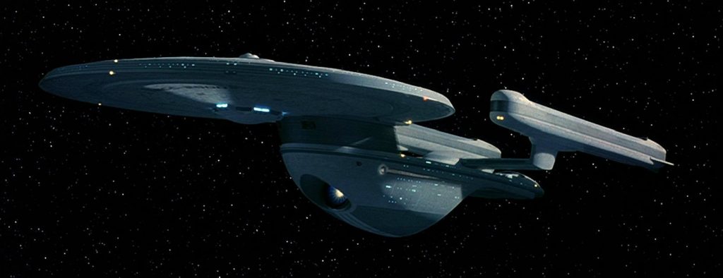
13. Constitution
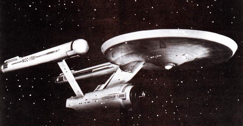
There’s no saving this misproportioned relic from the goofy raygun origins of Star Trek. It’s hopeless. It looks like it would have difficulty staying in one piece if it was a model, much less an enormous starship exceeding the speed of light. Somehow the disconnected nacelles of Discovery future ships are more credible than this toothpicky monstrosity.
Many attempts have been made to make it look good, but they have failed. At some point we need to let go of the past and stop rehashing it endlessly for nostalgia money.
Now excuse me while I write the rest of this list heavily biased by nostalgia.
12. Enterprise J
Kinda cool I guess. Or at least cool-adjacent. From that one angle. It’s a one off future that isn’t nearly as clever as the more fleshed out future in Discovery while still trying to communicate the same progression we see from Constitution (big nacelles, small saucer) to Galaxy (small nacelles, big saucer.)
When seen from other angles though, you realize it’s a silly twiggy thing that’s about as sleek as a caltrop.
11. NX-01
It’s trying to be an Akira, but also look like the Phoenix (the little rocket from First Contact) and also like the Constitution. It fails on most of those counts. Everyone inside is dressed like NASA astronauts but the ship looks like a flying saucer. Or a misshapen loaf of bread. In the opening credits we see something that looks like a Lockheed Venture Star with warp nacelles. That would have perfectly matched the vibe the show was going for, but they needed it to look like every other trek ship presumably due to branding. Product of compromise I say.
10. California
The Cali is jank, but of course it’s jank. It’s supposed to be jank. That’s the whole point. It fits the story role and theme of Lower Decks perfectly. It’s the Trek aesthetic taken to a silly extent. It’s unbalanced. It’s got a weird configuration. It looks like it’s about to tip over.
Still gets a low ranking, though, because its jank is somehow more severe than the other jank. Where is your center of mass, Cali?
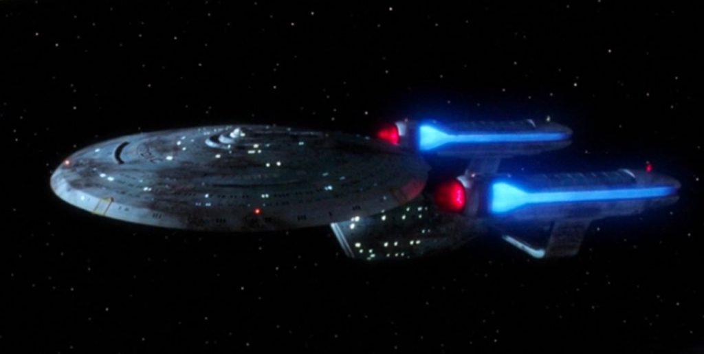
9. Excelsior
Big long and stately like an ocean liner. Also good looking enough that I don’t hate that it’s the generic federation ship they always use when they need another ship to avoid confusion with the hero ship. Kinda funny that it’s introduced as an unreliable heap dismissed by Scotty and later it becomes the backbone of Starfleet!
It would probably be higher if it’s elbow pylons weren’t so out of place on the otherwise elegant flowing design.
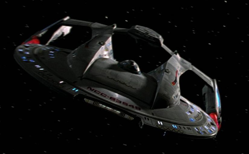
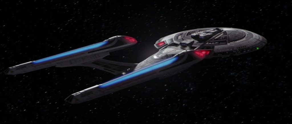
8. Intrepid
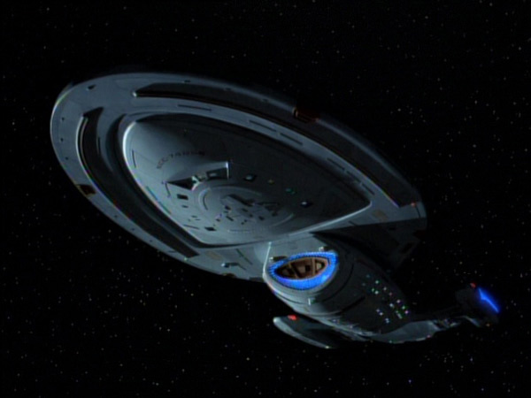
Good design overall, but the proportions are very weird and the inline nacelles never looked right. Has some good angles, some weird angles. Don’t get me started on the articulated nacelles!
It definitely sells the premise of a small under-equipped ship far from home though, a muscular design like the Akira wouldn’t have fit the bill.
Would have been pretty sick if they’d visibly patched it with Delta Quadrant tech so that by the end it looks unrecognizable, but the budget certainly wasn’t there for that.
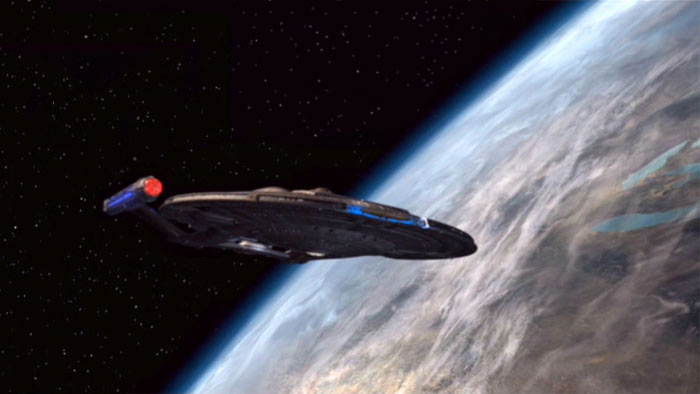
7. Defiant
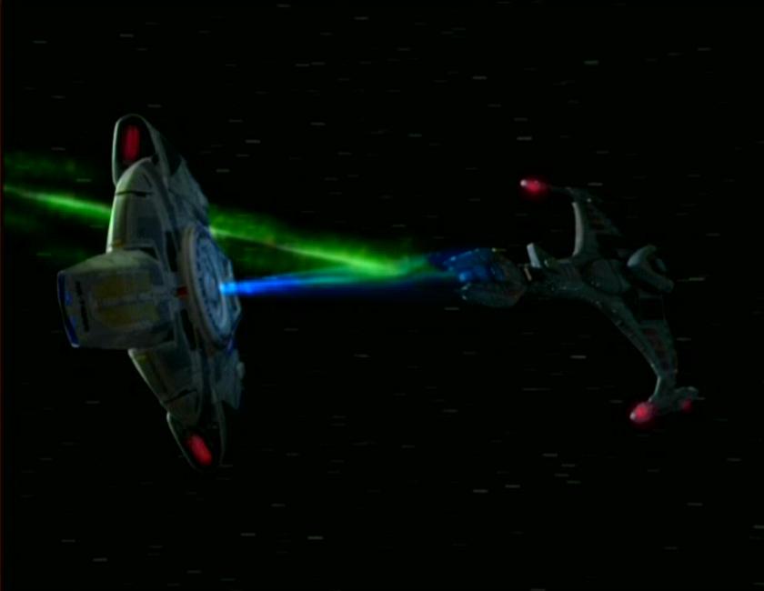
Federation BOP. It looks and flies more like the Millennium Falcon than any Enterprise. In the grand scale of Trek ships it’s more like a fighter than anything else a Starfleet captain gets to play with. It’s a runabout with all the concentrated high tech rage the Federation can muster bolted on, and wrapped snug in a hull instead of revealing its extremities. How they got around the ‘nacelles need empty space between them’ is anyone’s guess, but this is the only ship on this list that looks like it could take a hard landing and ever fly again.
‘What if Starfleet but no more Mr Nice Guy’ is not only a perfect description of this ship, but also of it’s Captain, Benjamin “For The Uniform” Sisko. That’s right, Benjamin “In the pale Moonlight” Sisko. It has the rare distinction of being the only ship on this list (to my knowledge) employed to ruin a planet’s biosphere on purpose.
6. Sovereign
They blew up the Enterprise D because they thought they could design something that looked better in widescreen.
Let that sink in.
The Sovereign has pretty good proportions but it’s a bit long (widescreen!) and looks less impressive from below. On top and on the side, though, it looks tough. It’s got the benefit of the whole TNG era development of design language plus a special effects budget. It’s sleek and a bit mean, befitting the darker, edgier take on Piccard in it’s debut film, First Contact. After it’s one action sequence, it spends most of the movie getting taken over by aliens, which is the normal occupation for a TNG starship.
5. Crossfield
You have to admire the decision to go with something so different from other Federation ships-unique design elements like the multi ringed saucer and huge delta shaped engineering hull and (eventually) disconnecty nacelles that float around adorably during spore drive jumps. It’s a bold design that signaled that the show wasn’t going to be a rehash in the way that the movie series that preceded it was.
4. Nova
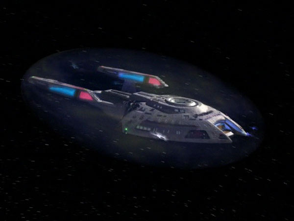
The Nova takes the aggression of the Sovereign, cranks it up, and packages it all into a cute little spaceship smaller than an Intrepid. It’s design wasted on a science vessel; it would have made a better design for the defiant if it had existed a few years earlier.
I will confess some bias here; it’s one of the ships you can fly early on in Flash Trek: Broken Mirror, and it made me feel like I’d made it as a starship captain.
They also gave Harry Kim one as a joke (it’s small and they named it the Rhode Island) which is hilarious.
3. Ambassador
Remember how this started as a response to Ars’s ranking of starships? This is the part where I pretty much agree.
The Ambassador somehow manages to nail the ideal proportions for a standard configuration starfleet vessel. The nacelles aren’t too big, the engineering section isn’t too flat, everything is just right. It’s like if you asked a kid to sketch a new starfleet vessel and didn’t nerd rage when they failed to perfectly match the jank of the Constitution and the Galaxy. It’s design fades into the background like a good soundtrack.
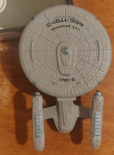
I will confess to bias here too, because I had the micro machines version of this (as well as others) but this is the one that no adult could recall from the show and thus impose some sort of story value on it; I was free to make up my own space adventures for this little guy.
As you can see, Galoob took liberties designing this model, it’s more detailed than the studio model in some places!
2. Akira

Another tough looking federation ship. This looks like starfleet took a nod from the Klingons. The downward angled arms give it a fierce bird-of-prey visage. It has a couple of weird angles, but overall it looks great and has solid proportions. It shows up in the beginning of First Contact to represent a starfleet ready to fight the Borg after the disaster of their last serious showdown, and has some great shots executing Piccard’s plan to blow up a Borg Cube. It looks sleek and mean but still weighty which is a rare mix for a Trek ship.
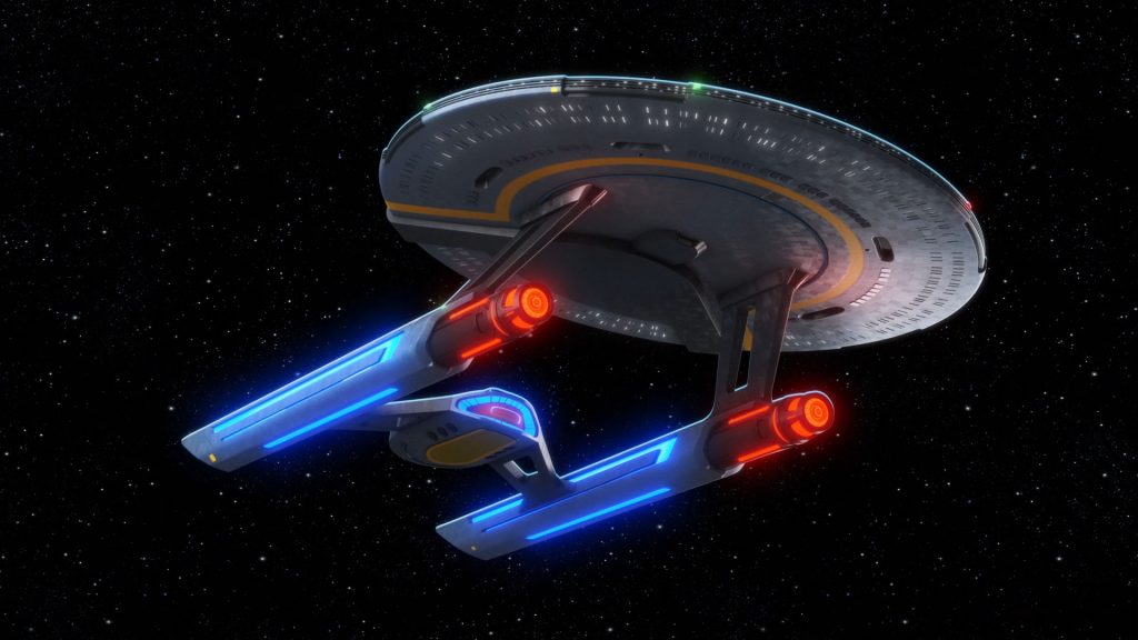
1. Galaxy
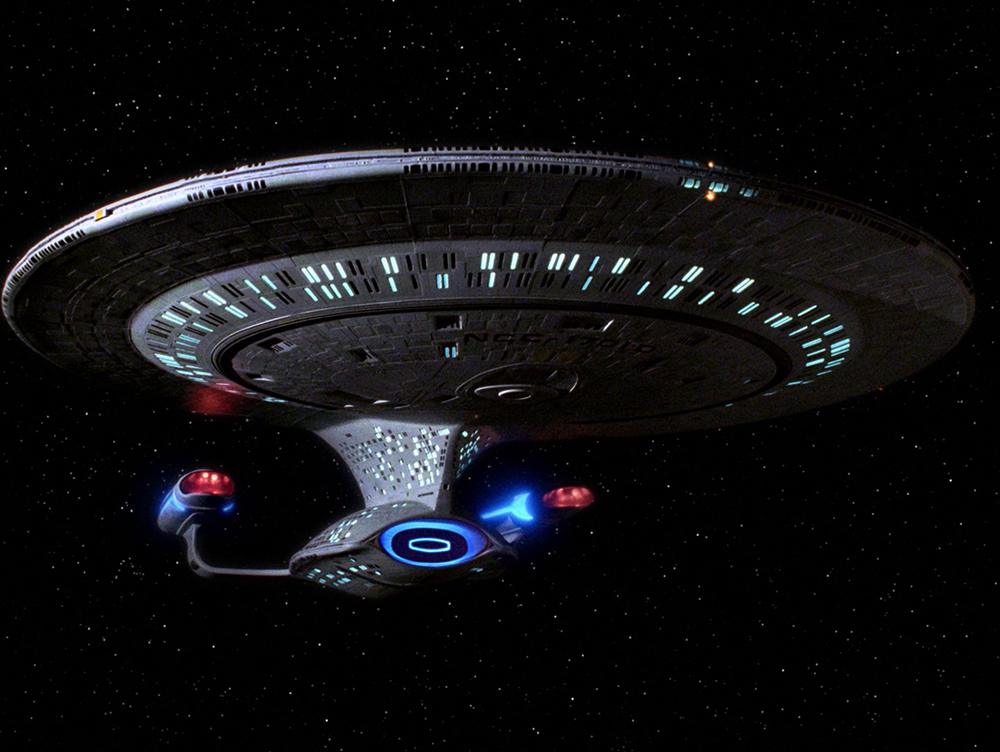
I don’t care if it looks jank or top-heavy. The biggest statement it makes is: this ain’t hard scifi. It’s carrying a whole civilization around in that giant saucer. A world that the audience will love to inhabit episode after episode. So of course it’s got a big silly saucer. It still somehow looks less likely to fall apart than the Constitution.
If the constitution says ‘this is schlocky space western stuff’ the Galaxy says ‘This is high concept science fiction that we are going to take extremely seriously, perhaps too seriously for a few seasons.’
If the Defiant is the Federation’s closed fist, this is the Federation’s welcoming wave. It says “look, we mastered physics completely, but we don’t want to fight about it, we just want to party on the holodeck while we explore the farthest reaches of the universe.” And that’s the kind of optimism that Trek can, on a good day, embody.